Classic Chrome recipes
Classic Chrome, a Fujifilm film simulation
Muted color and hard truth: the documentary look.
Classic Chrome is Fujifilm's homage to the American reportage aesthetic: the desaturated, matter-of-fact color of mid-century magazine photography. Unlike the other simulations it isn't named for a Fujifilm stock; its palette is closer to the Kodachrome pages of LIFE and National Geographic: muted reds, slate-leaning blues, and shadows that fall off harder than the color suggests.
The character comes from restraint. Saturation is pulled down across the board, but contrast, especially in the shadows, stays firm, so images feel weighty rather than washed out. Skin renders subdued and believable, which is why the look works as well for street portraits as it does for architecture and overcast cities.
It's arguably the most recipe'd simulation in the community: Classic Chrome is the backbone of countless Kodak-inspired looks, where white balance shifts toward warmth and careful highlight/shadow splits turn the muted base into everything from 60s press photo to faded summer nostalgia.
Best forStreet photography · Documentary · Overcast light · Kodak-inspired recipes
24 recipes · 50 real photos, read straight from EXIF
Classic Chrome recipes
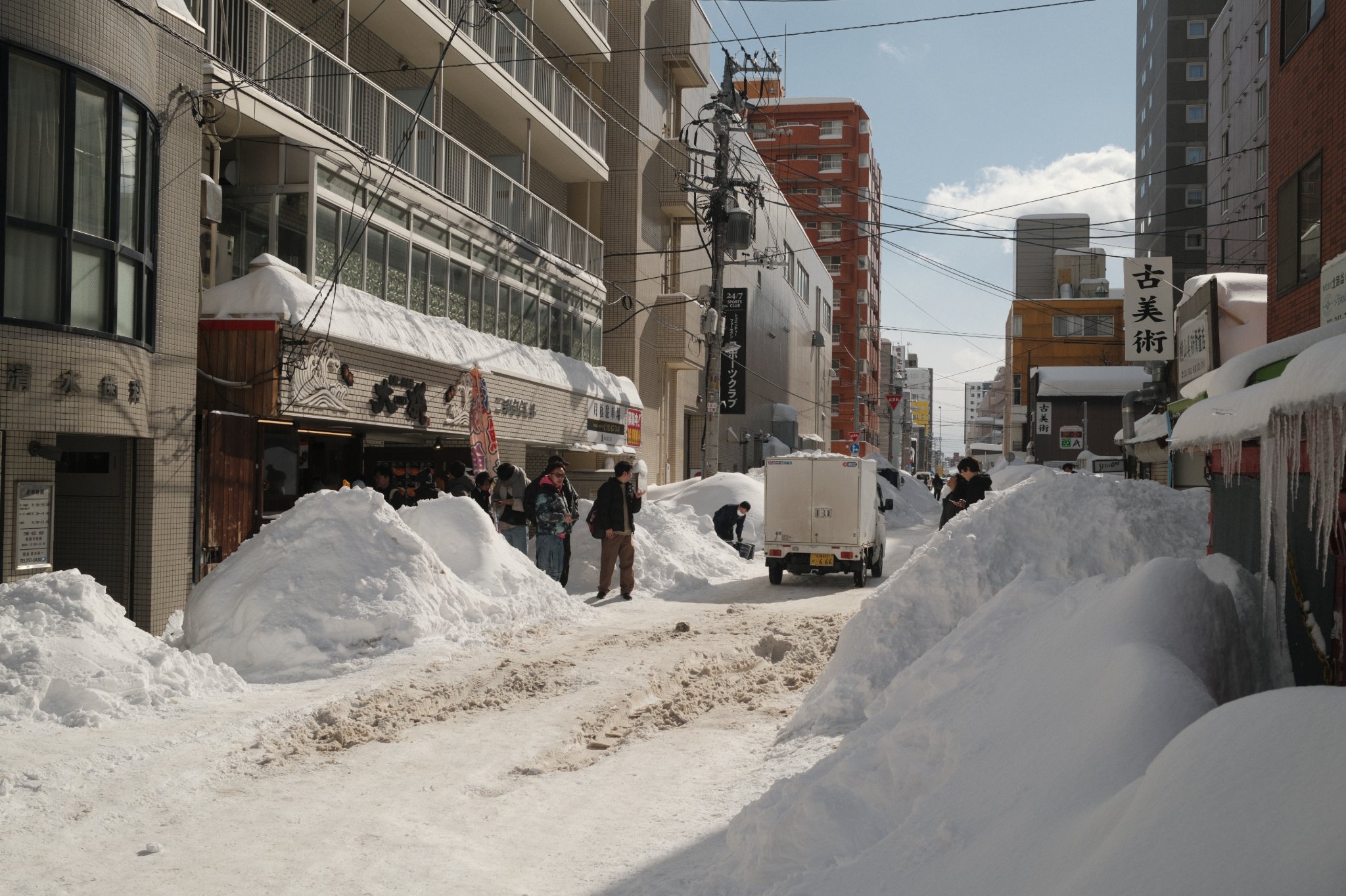
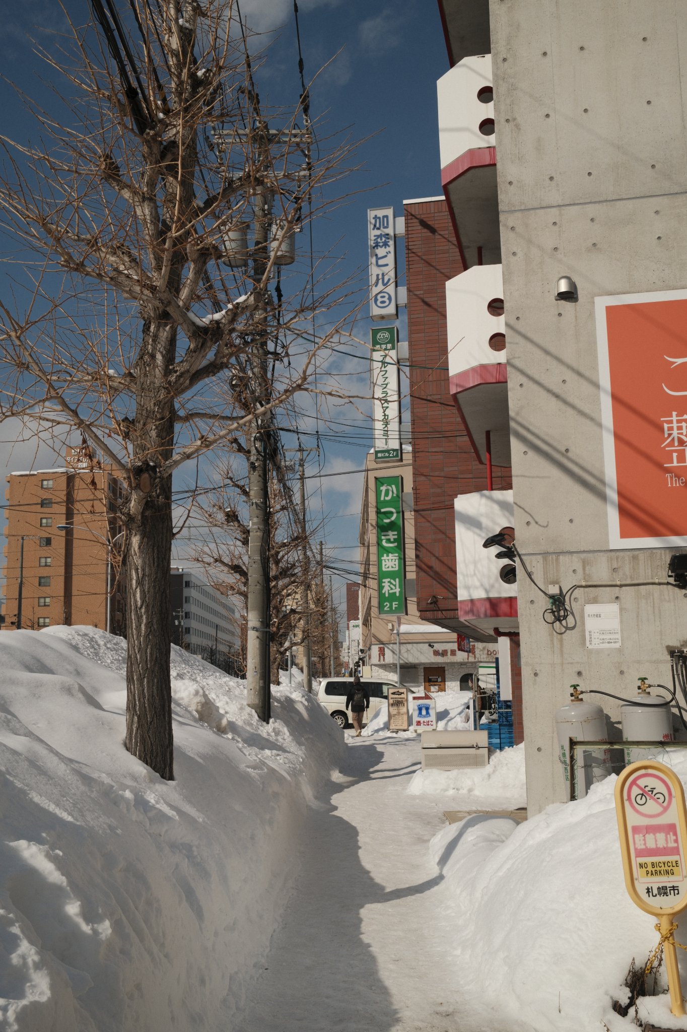
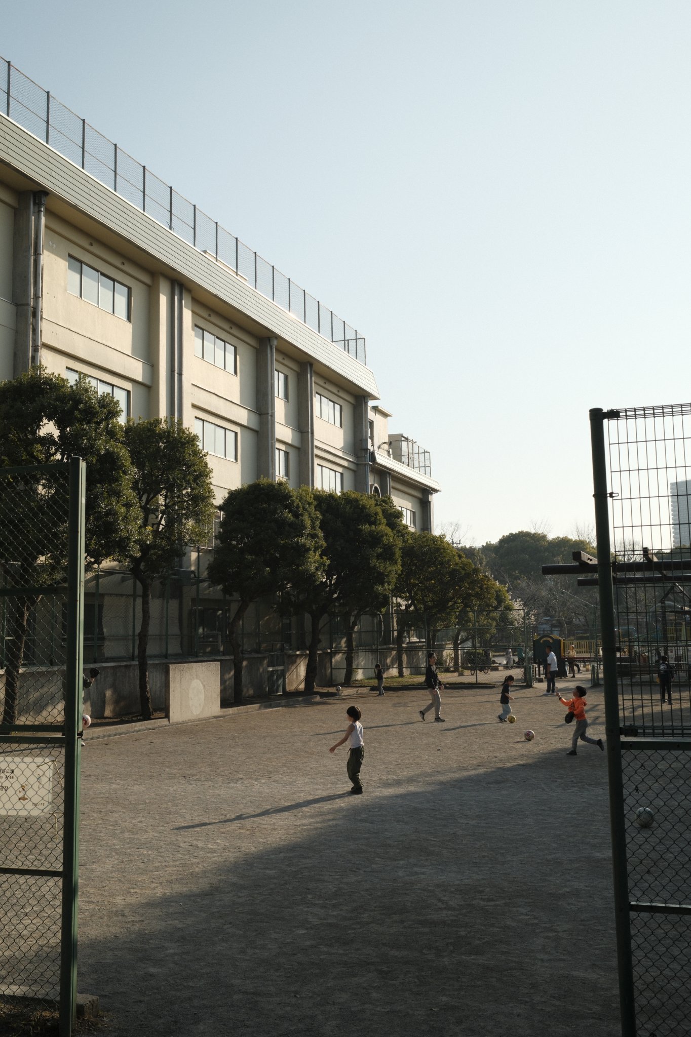
Classic Chrome
Classic Chrome
WarmVibrant
7 photos · 4 saves
first here: @binhnefits
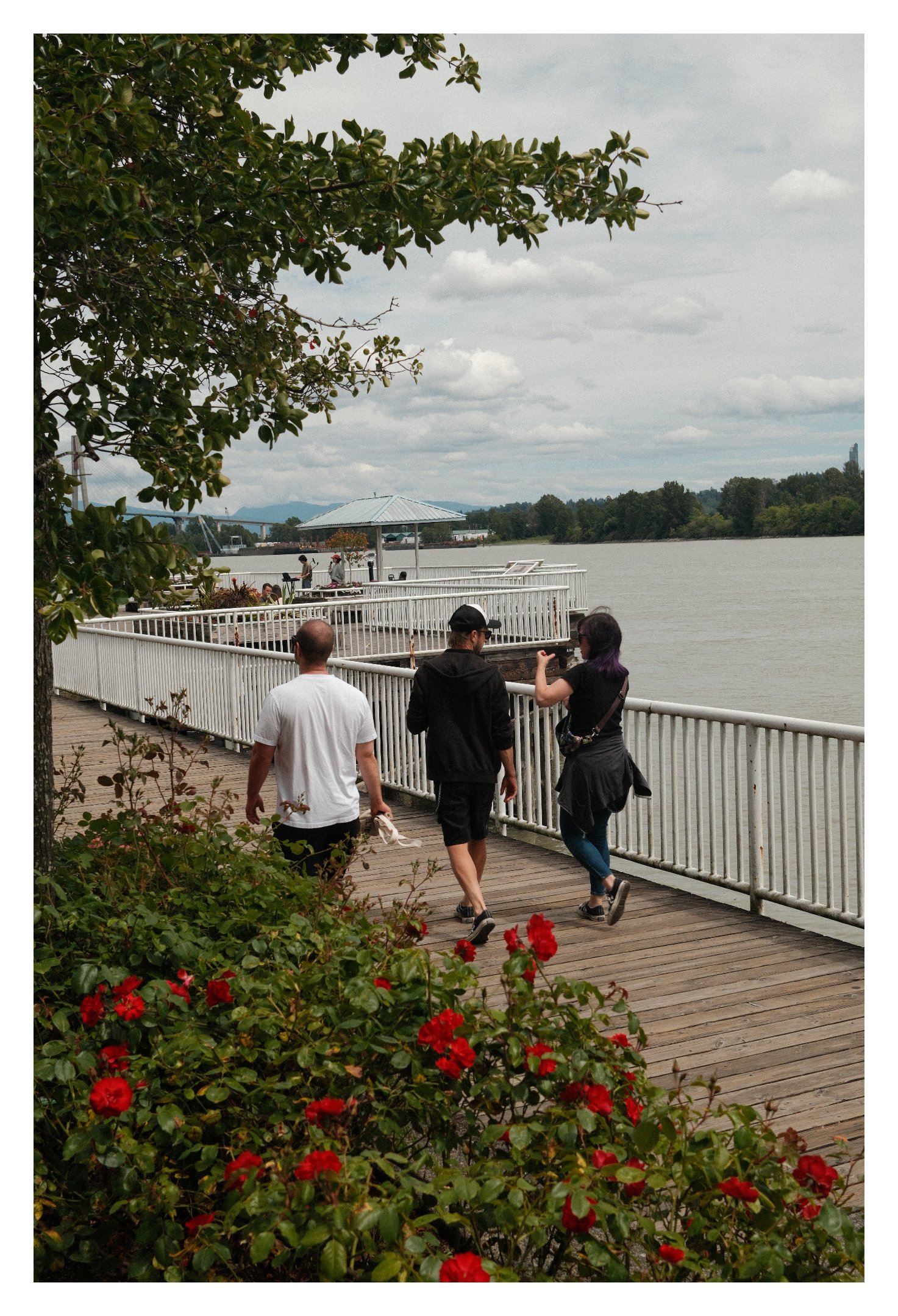
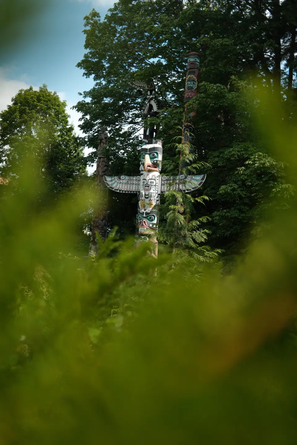
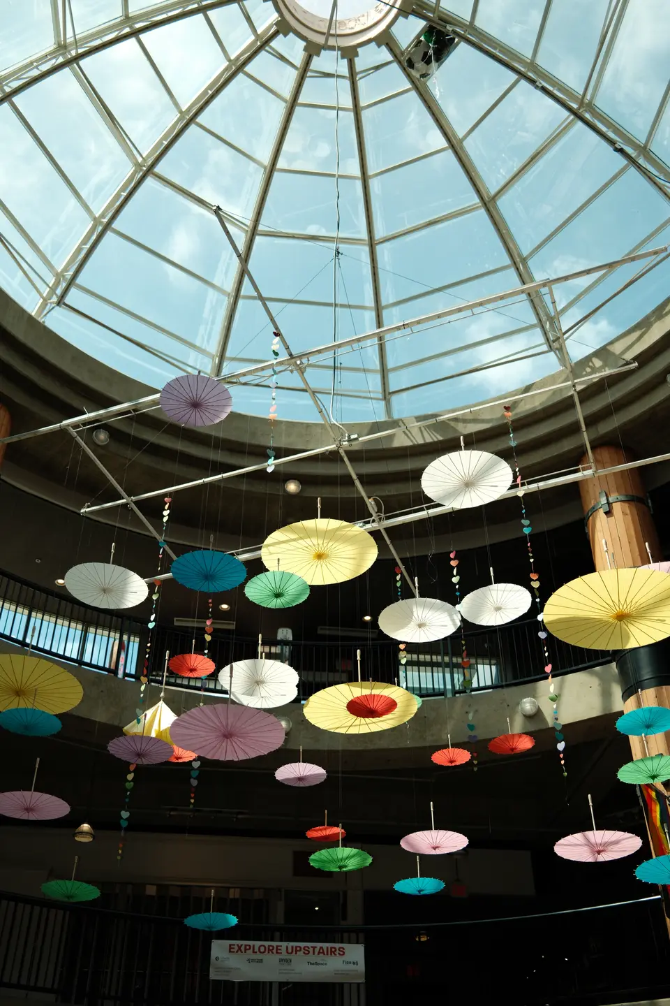
Classic Chrome
Summer Chrome
WarmVibrant
8 photos · 1 save
first here: @lucas
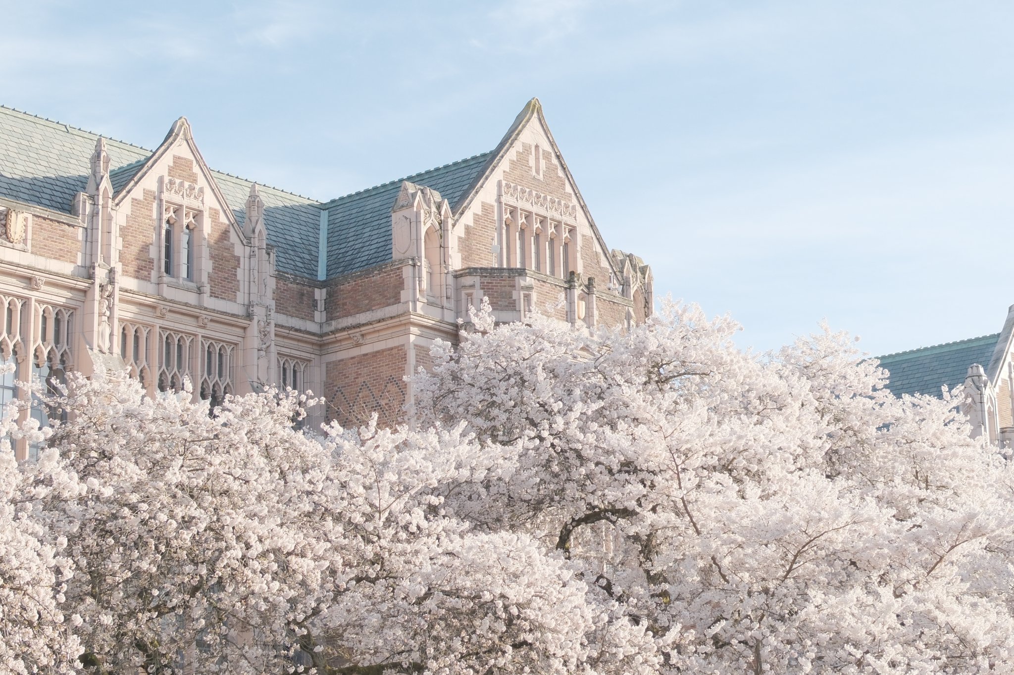
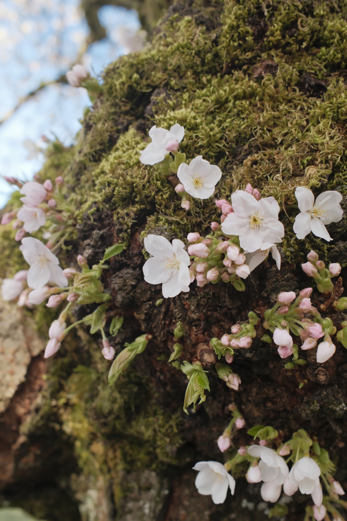
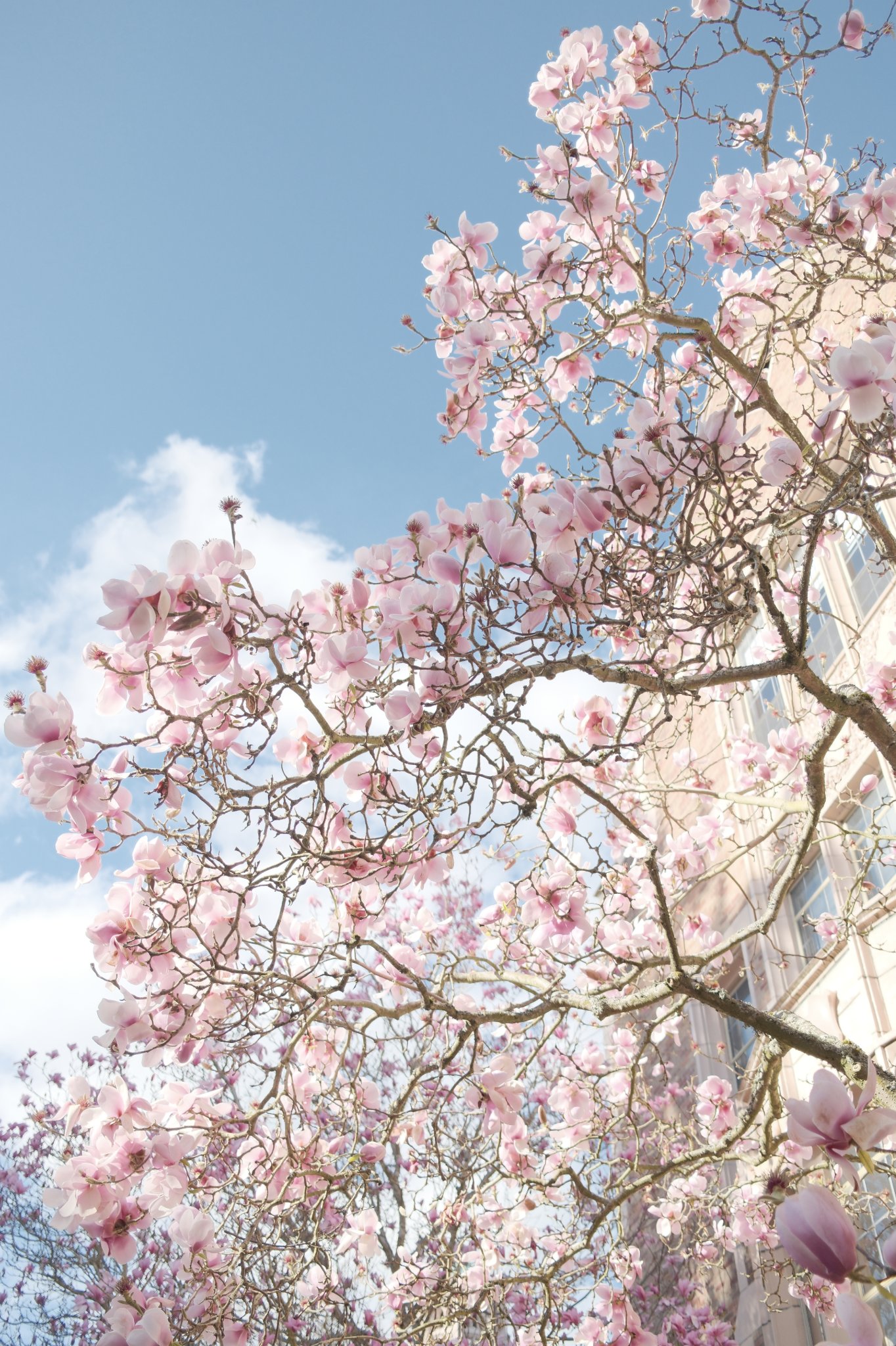
Classic Chrome
Sakura Spring
WarmAiry
7 photos · 1 save
first here: @binhnefits

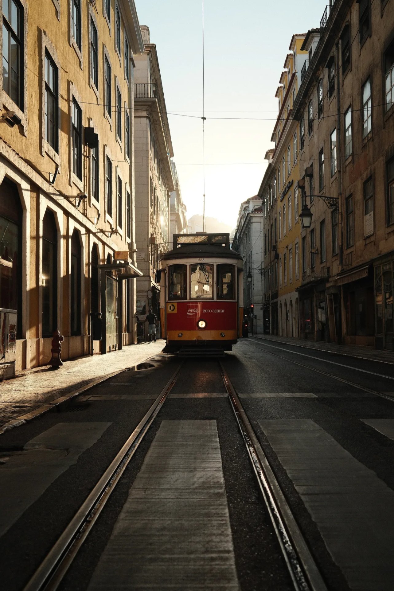
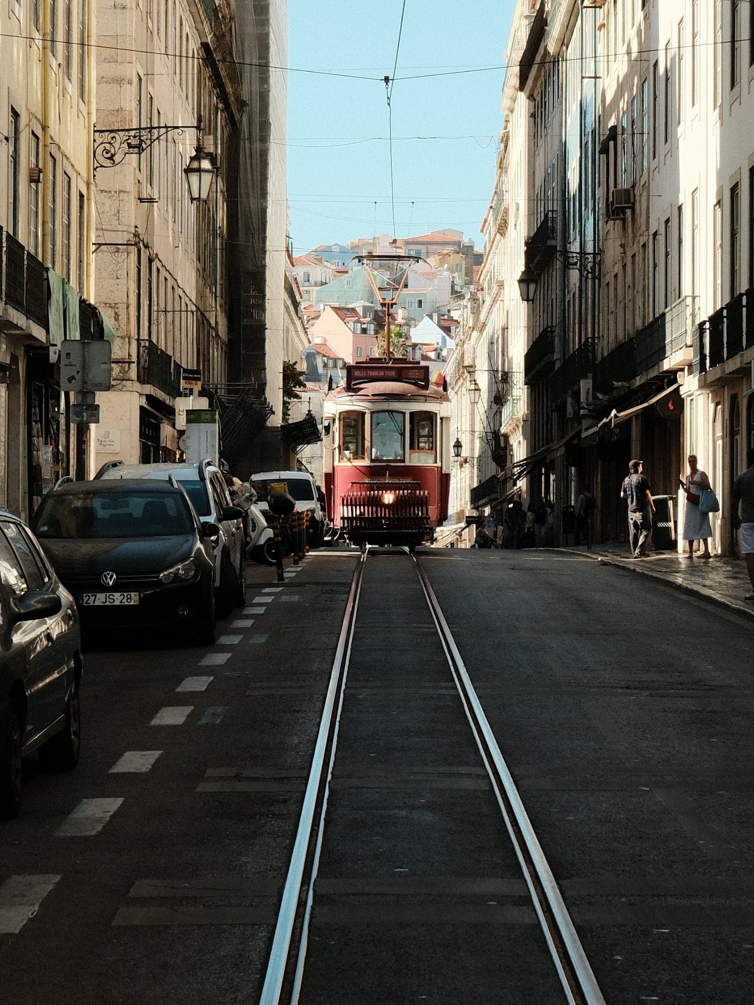
Classic Chrome
Classic Chrome
WarmVibrant
3 photos · 2 saves
first here: @lennisun
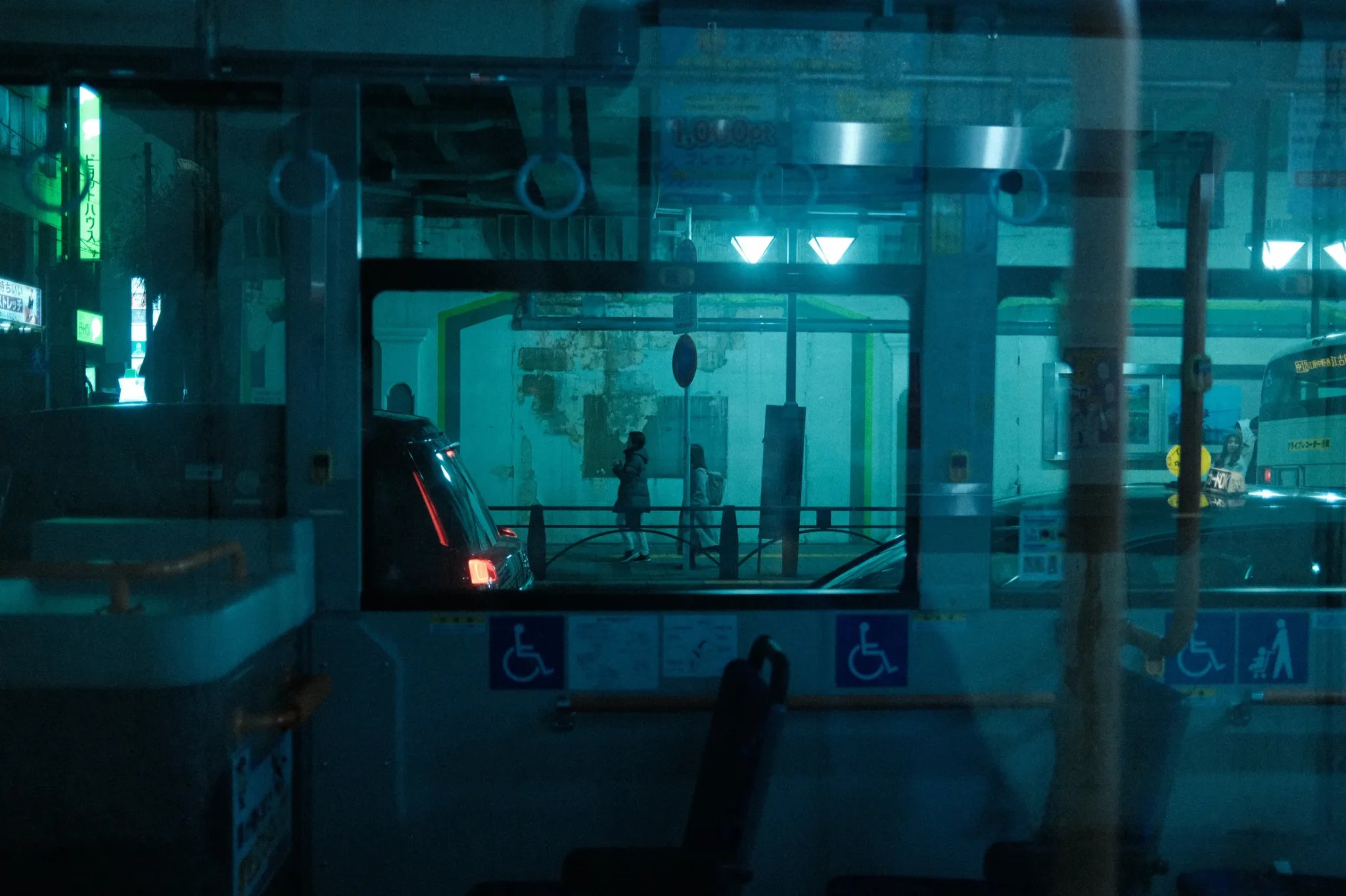
Classic Chrome
Serr's 500T
CoolAiry
1 photo · 3 saves
first here: @lennisun
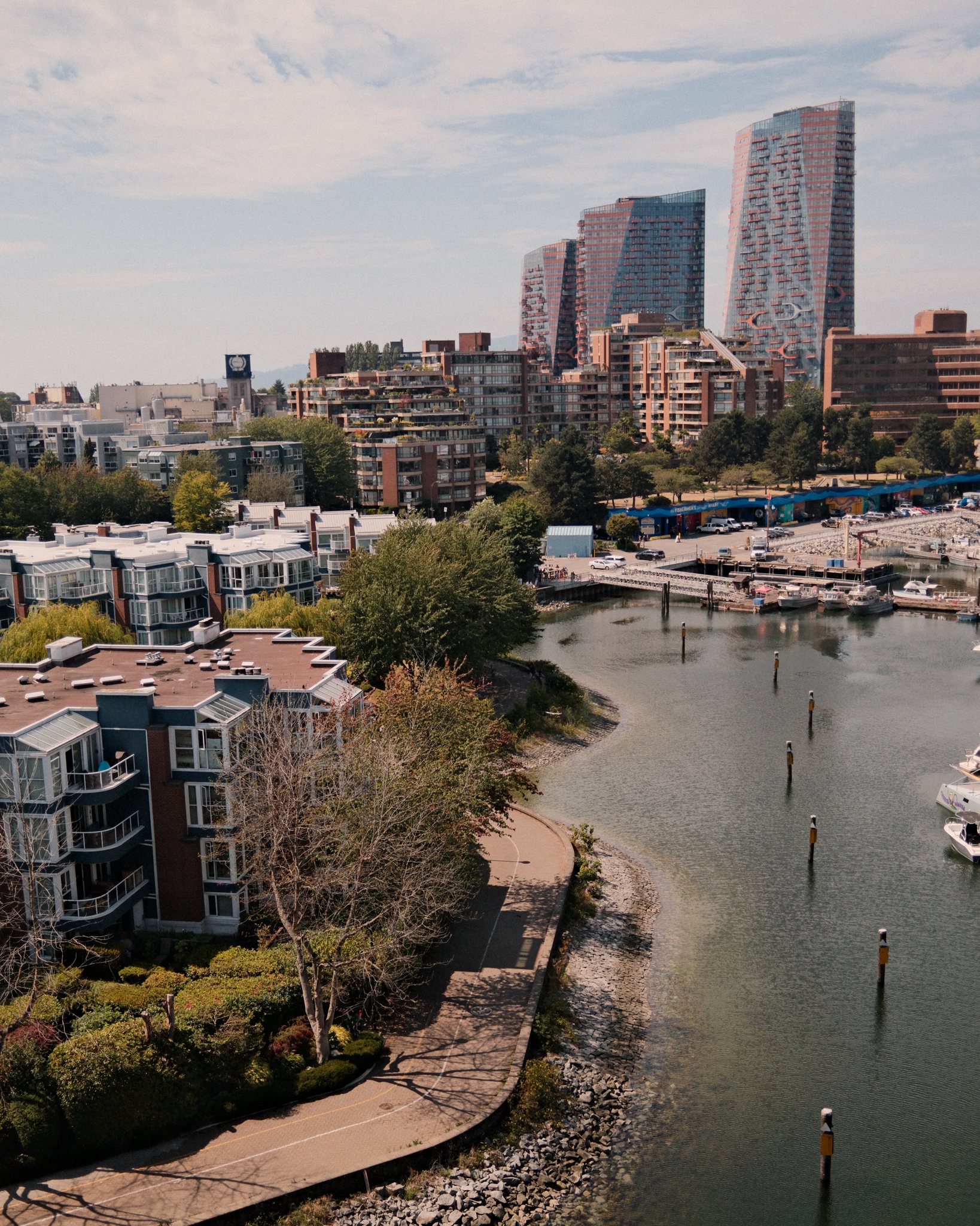
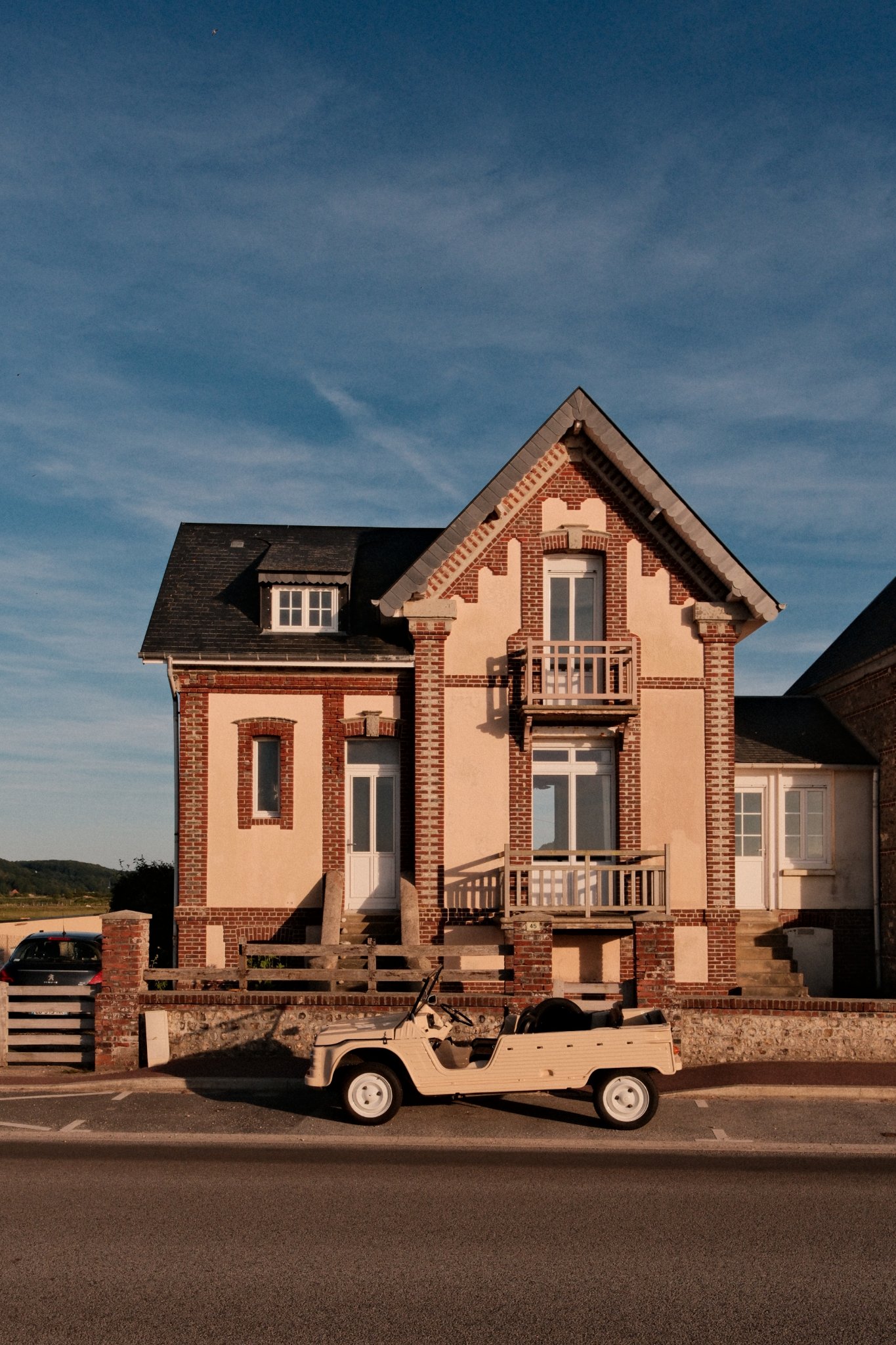
Classic Chrome
Classic Chrome · vibrant
VibrantNostalgic
2 photos · 2 photographers · 2 saves
first here: @pascalf
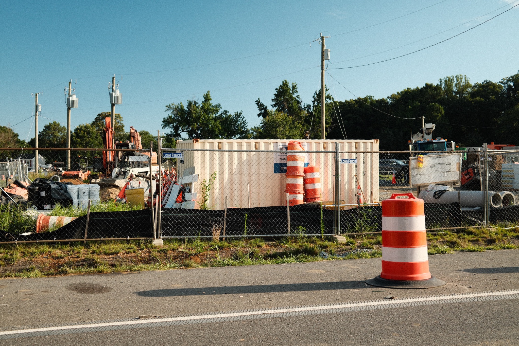
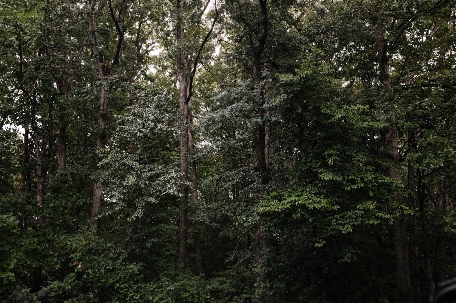
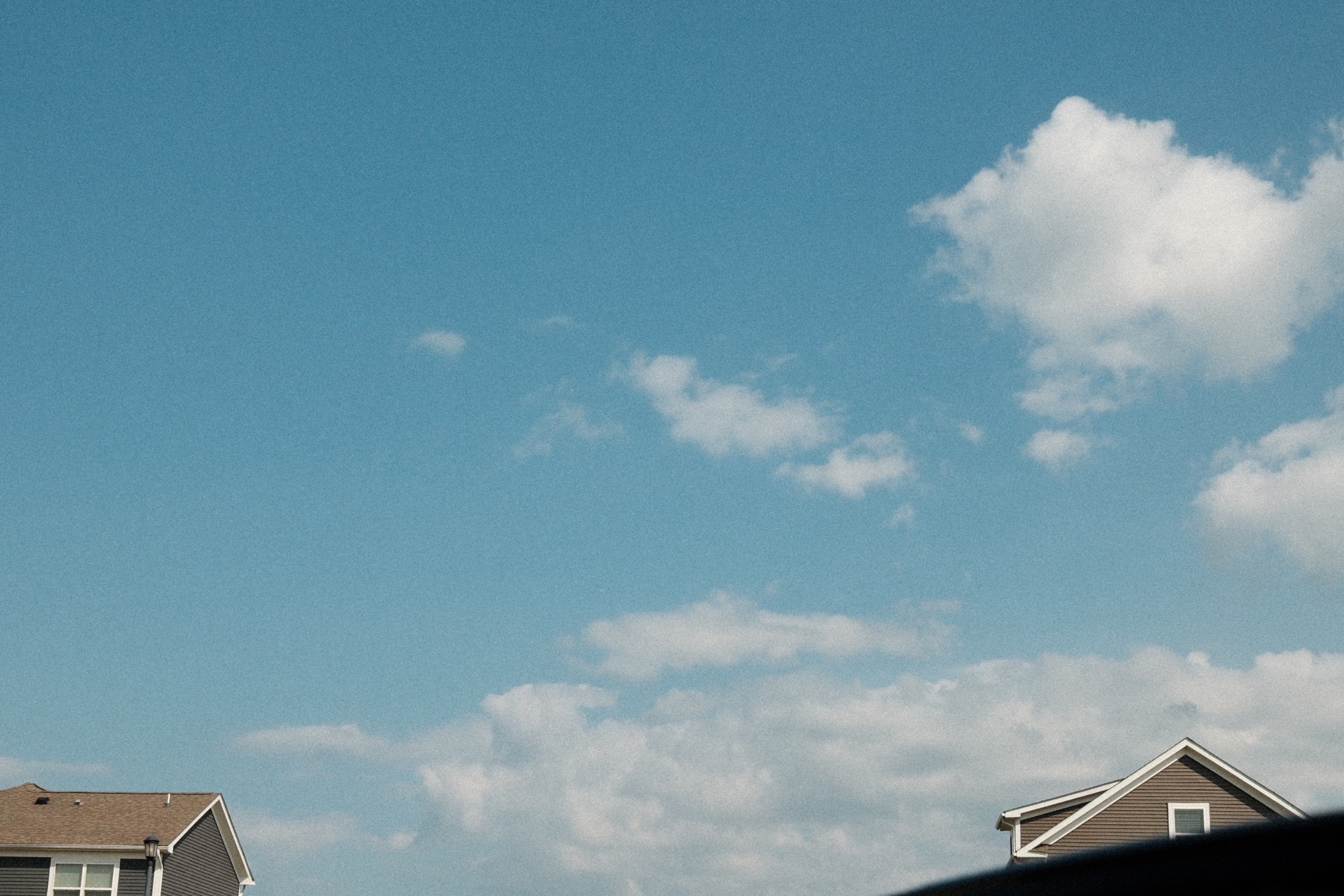
Classic Chrome
David’s Chrome
WarmVibrant
4 photos · 1 save
first here: @davidx100vi
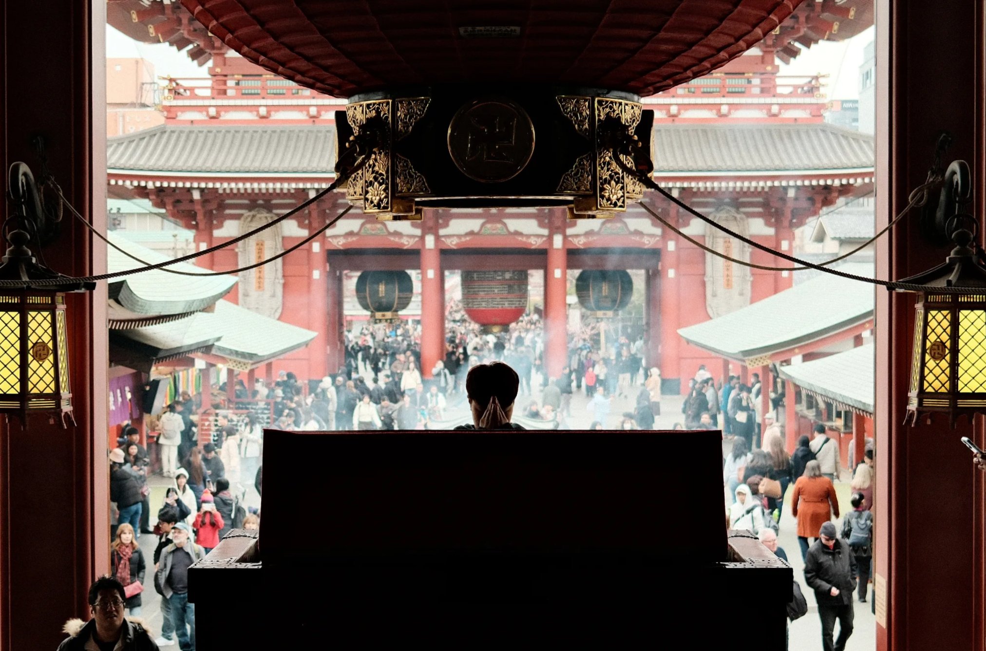
Classic Chrome
Classic Chrome
WarmVibrant
1 photo · 2 saves
first here: @lennisun
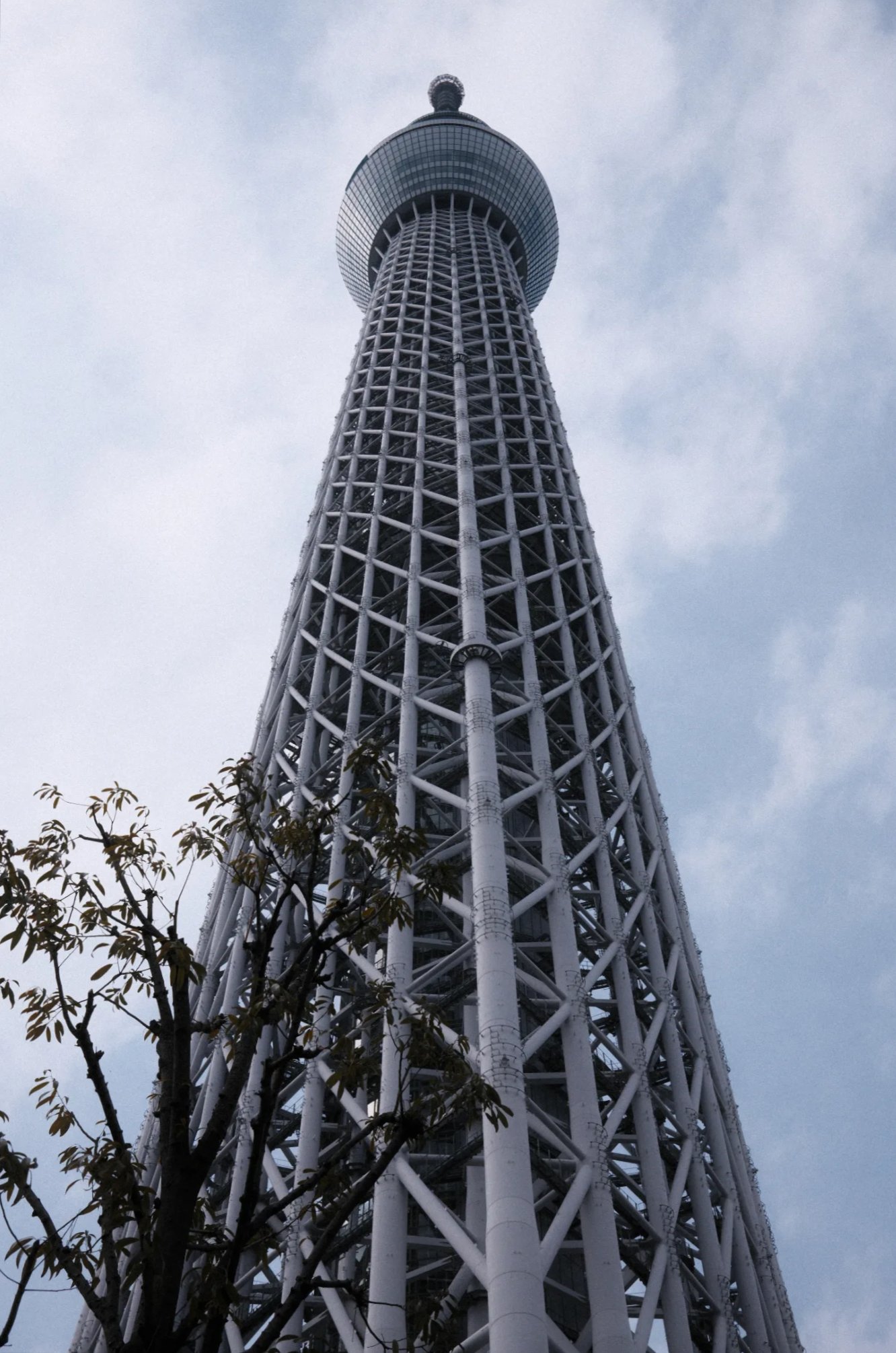
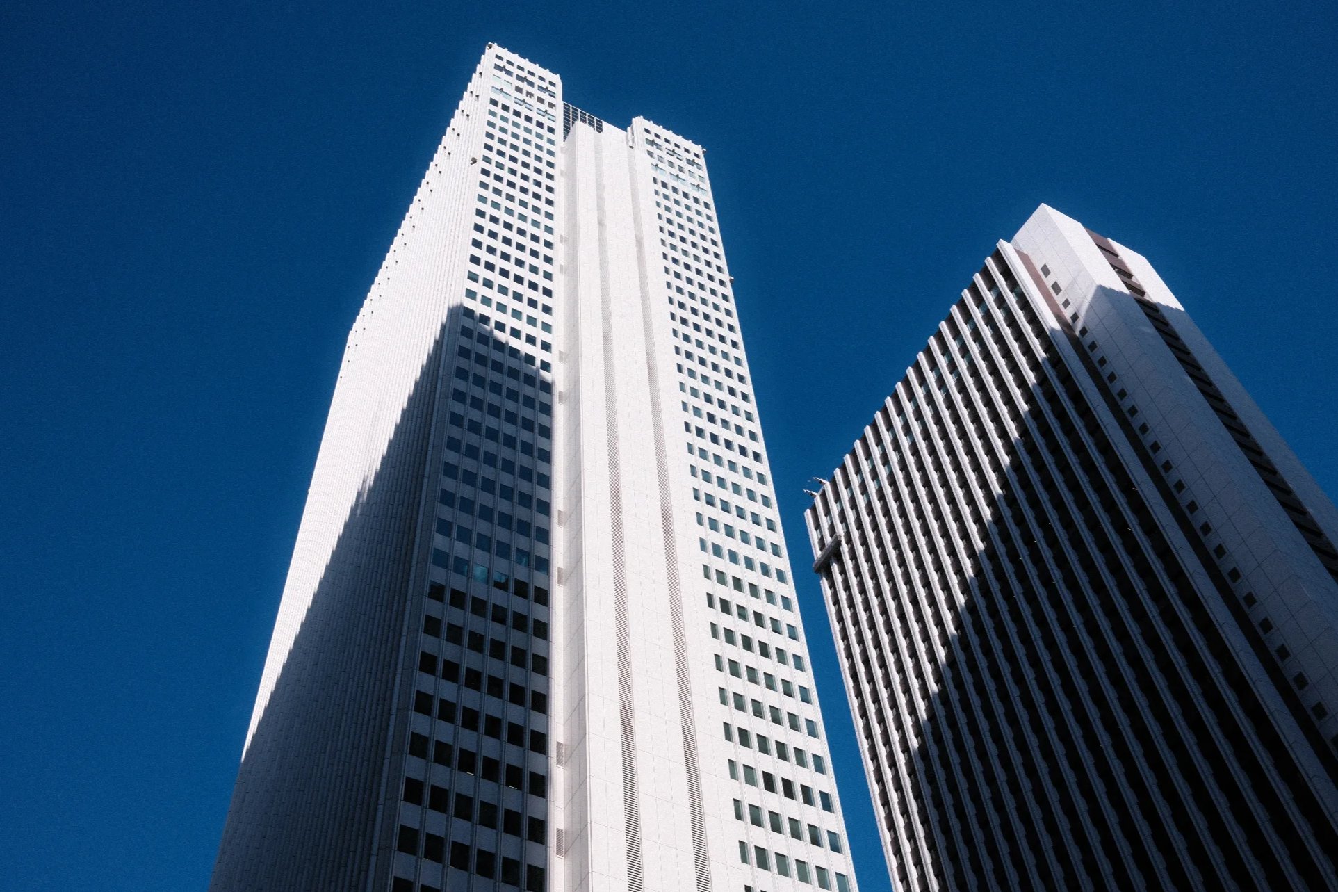
Classic Chrome
Old Ektachrome
WarmVibrant
2 photos · 1 save
first here: @lennisun
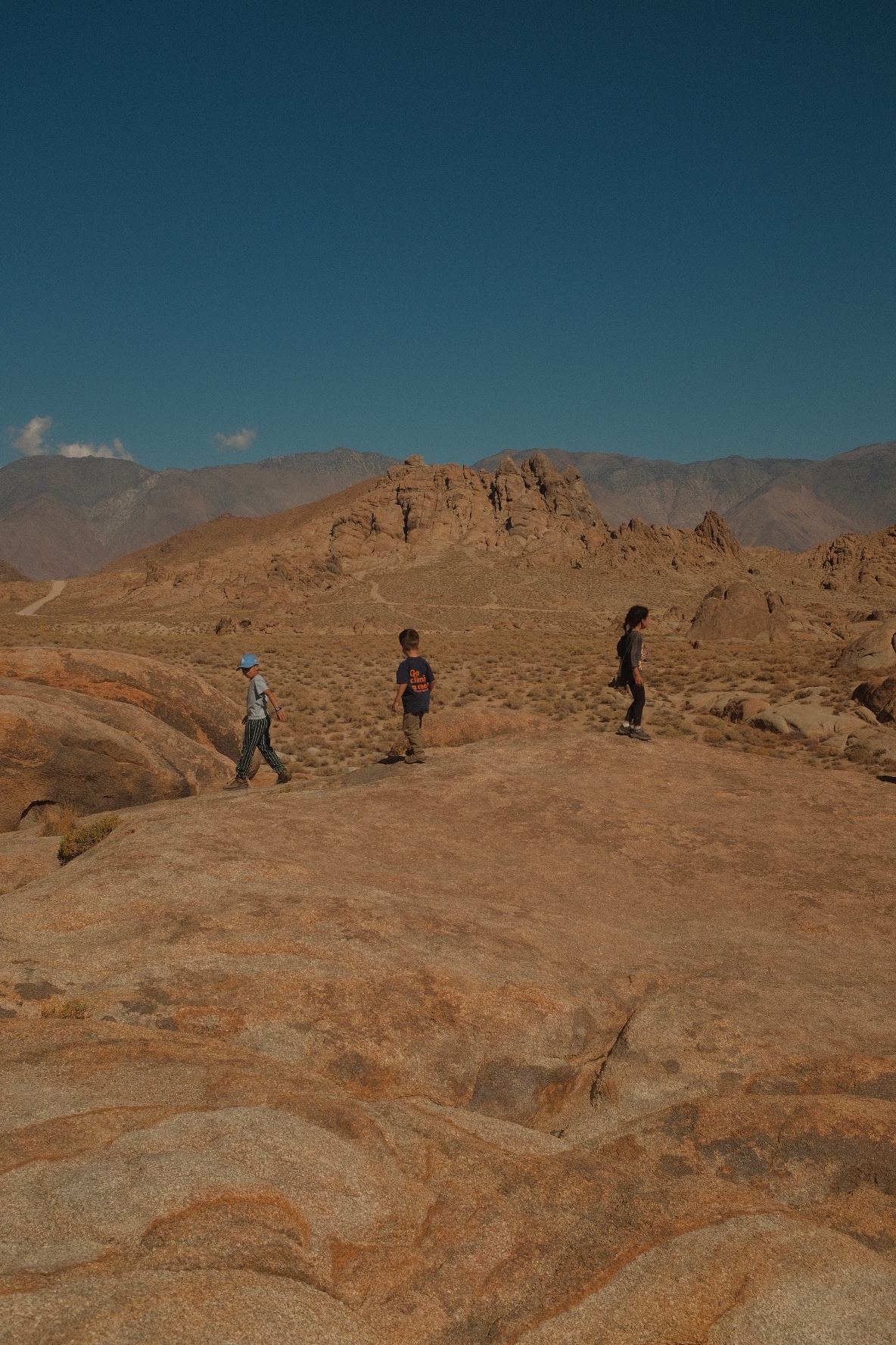
Classic Chrome
Classic Chrome
WarmVibrant
1 photo · 1 save
first here: @mareeda
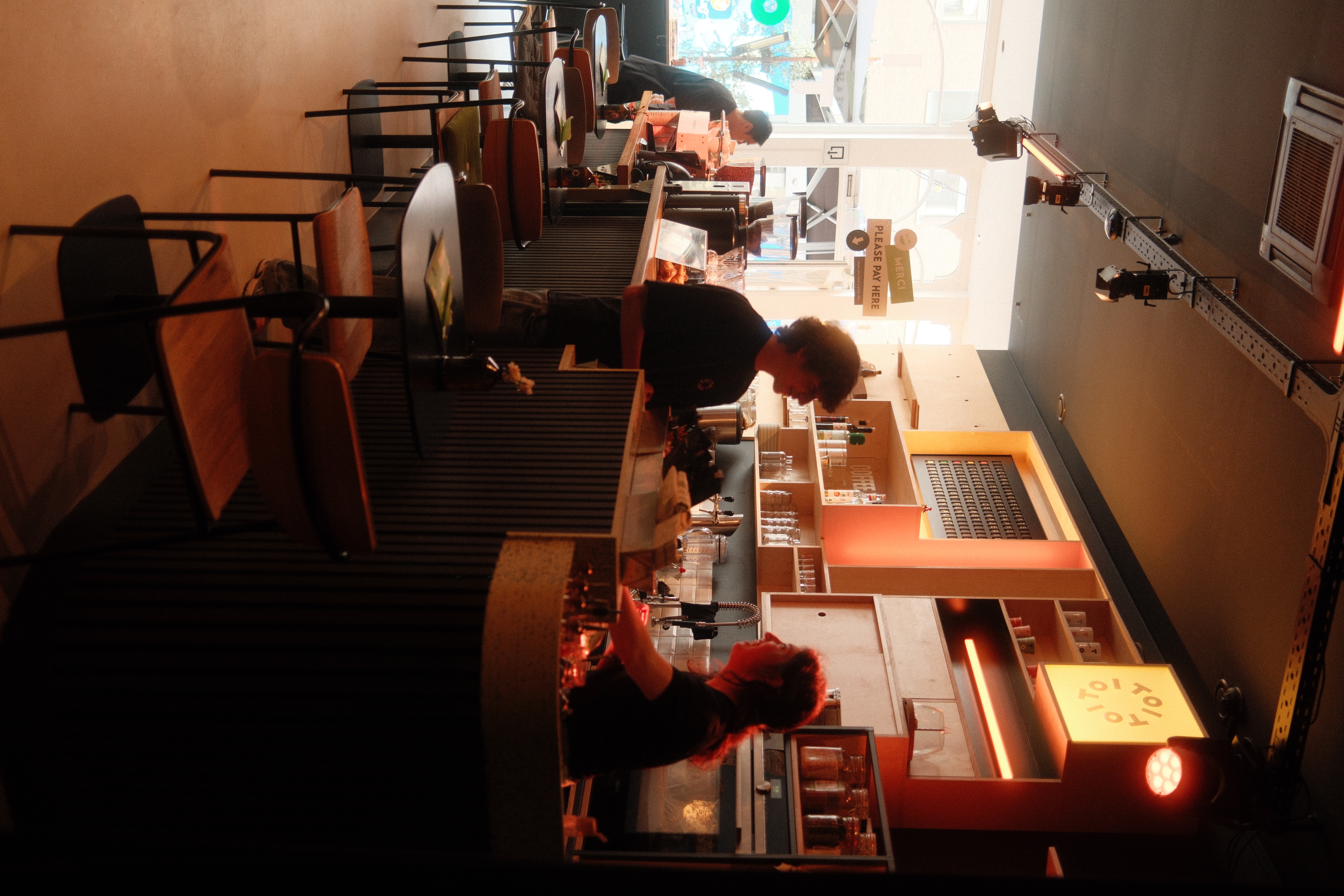
Classic Chrome
Classic Chrome
WarmVibrant
1 photo · 1 save
first here: @qbraem
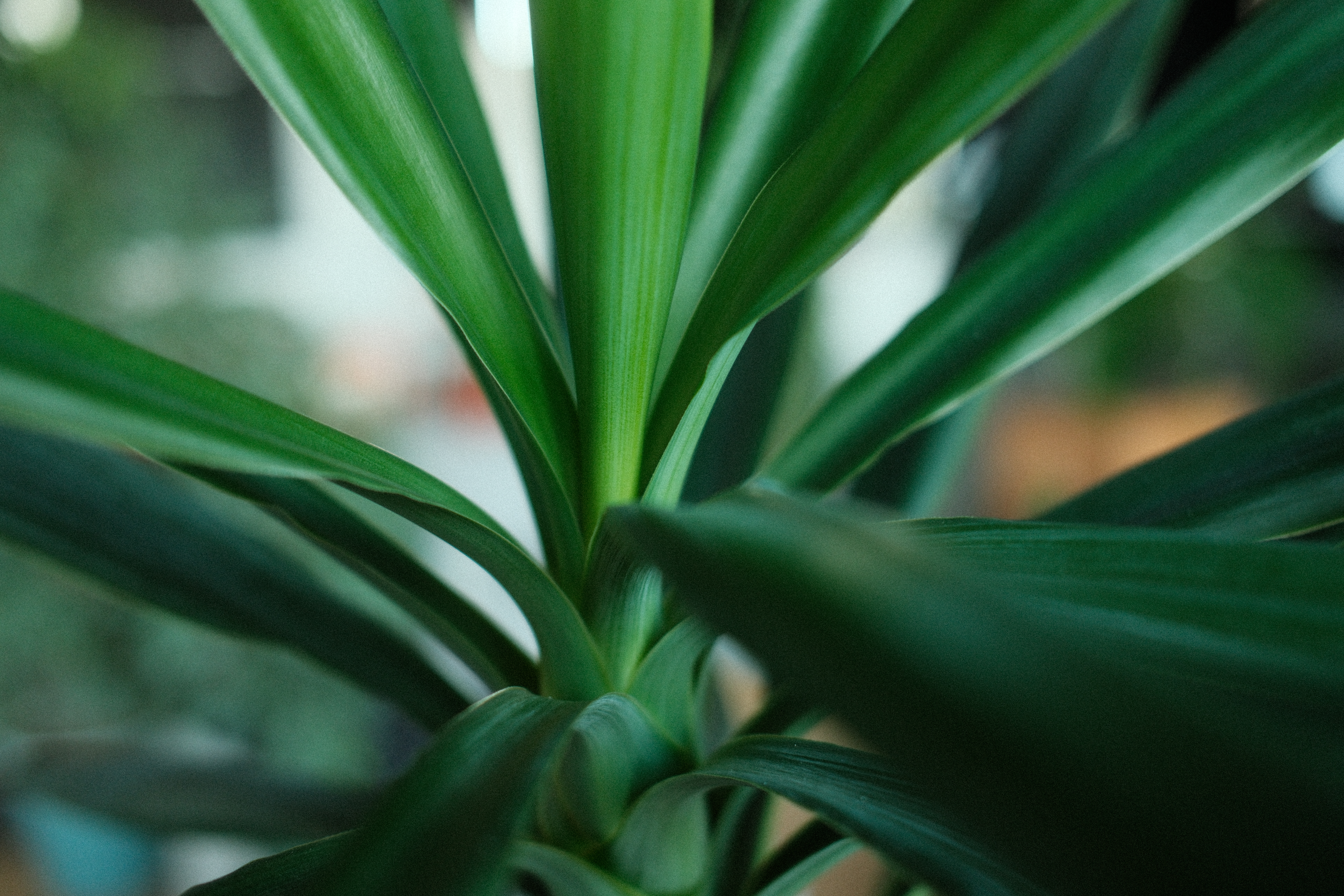
Classic Chrome
Classic Chrome
WarmVibrant
1 photo · 1 save
first here: @qbraem
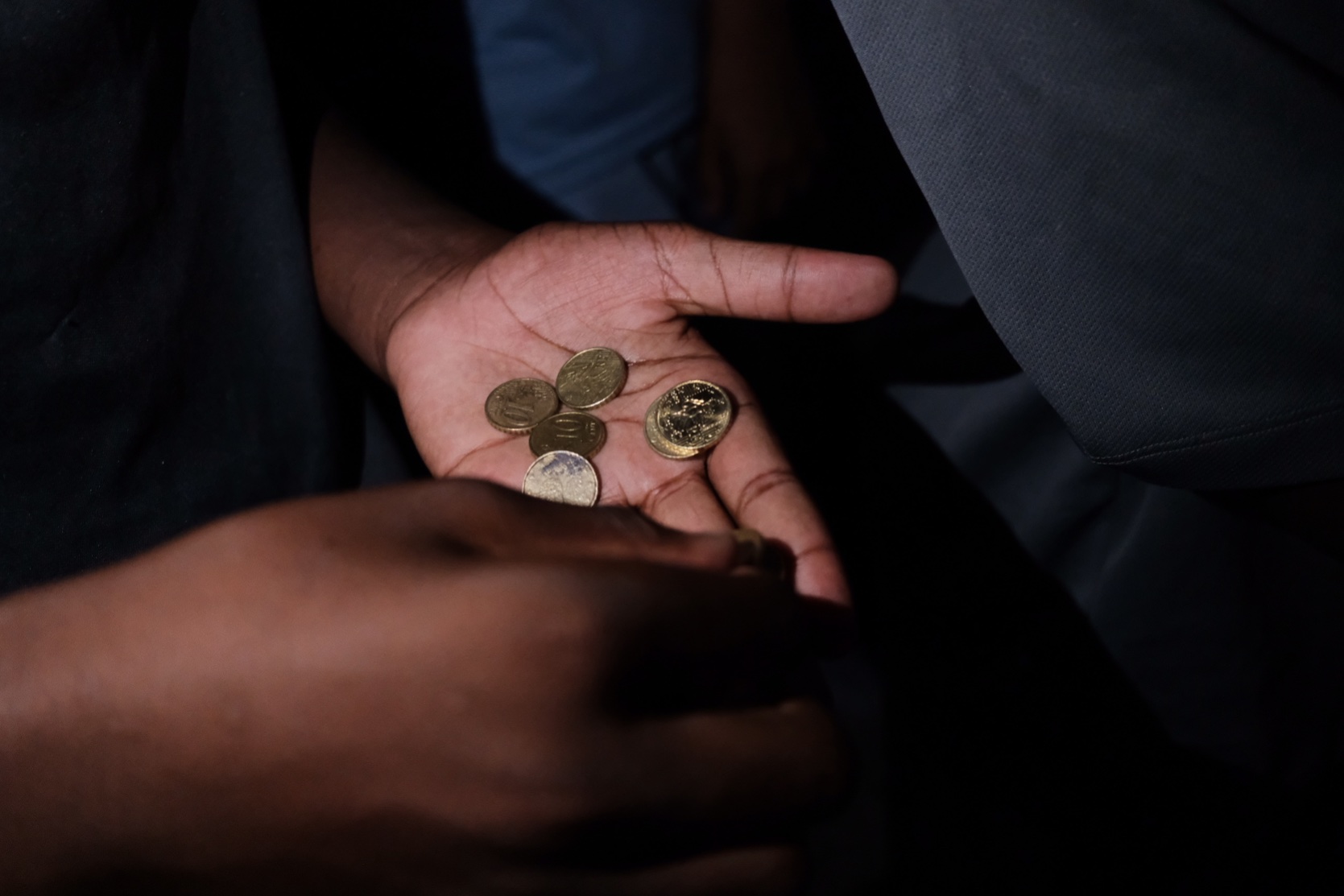
Classic Chrome
Classic Chrome · cool
CoolVibrant
1 photo · 1 save
first here: @jeromecoco
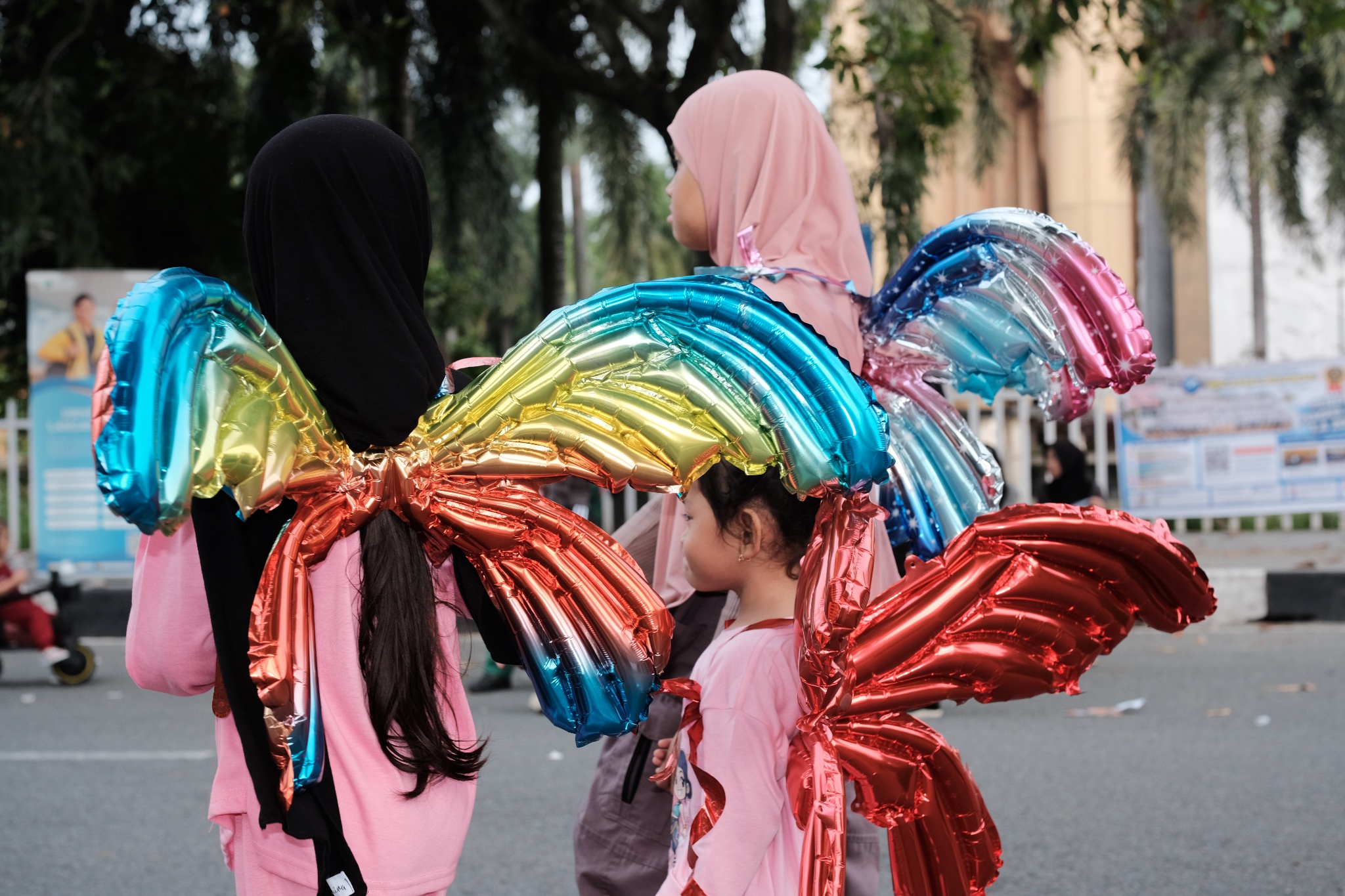
Classic Chrome
Classic Chrome · cool
CoolNostalgic
1 photo · 1 save
first here: @msaidalqudhri
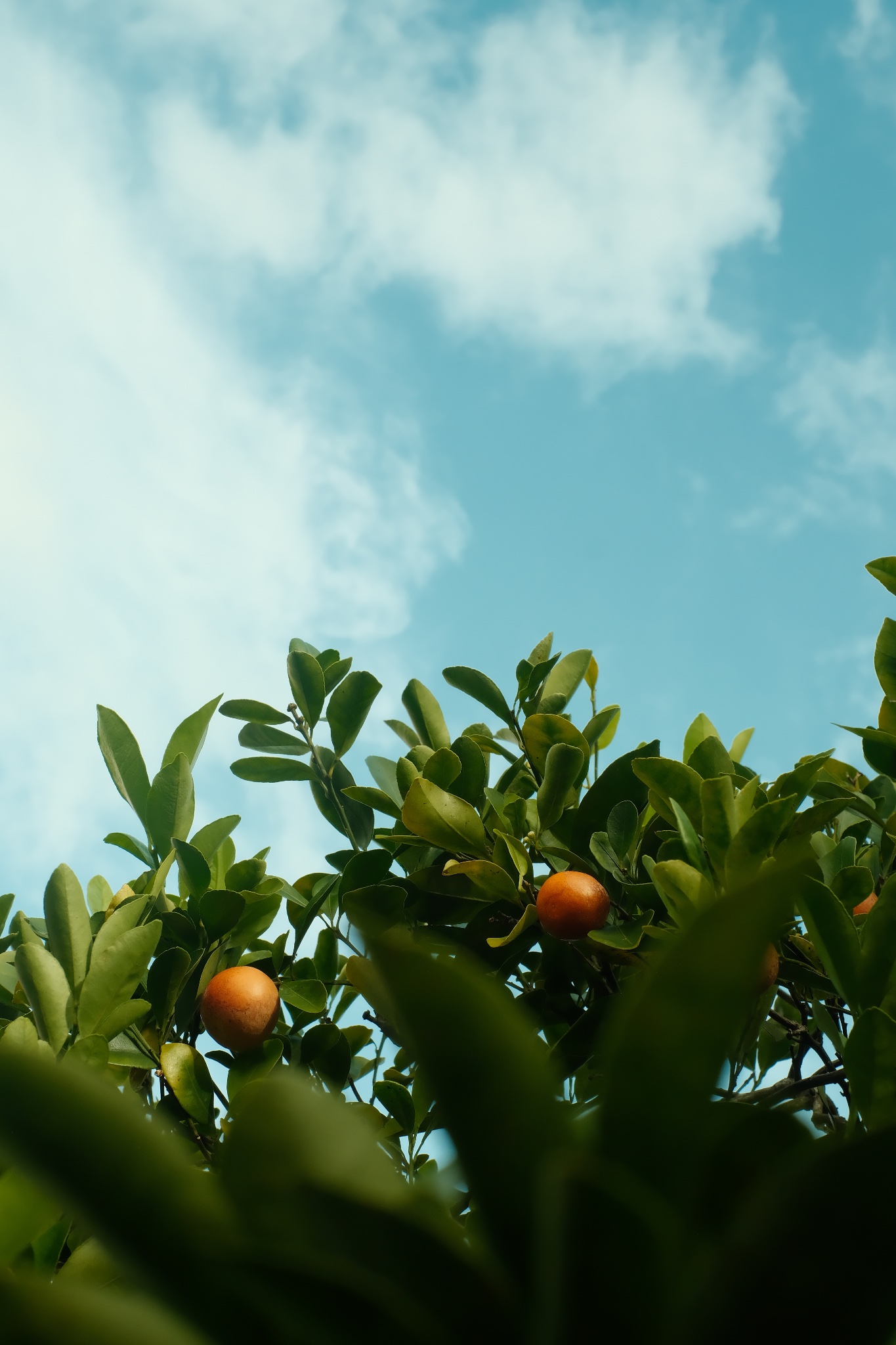
Classic Chrome
Classic Chrome · vibrant
VibrantNostalgic
1 photo · 1 save
first here: @cyrius974

Classic Chrome
Classic Chrome · warm
WarmVibrant
1 photo · 1 save
first here: @giovannid
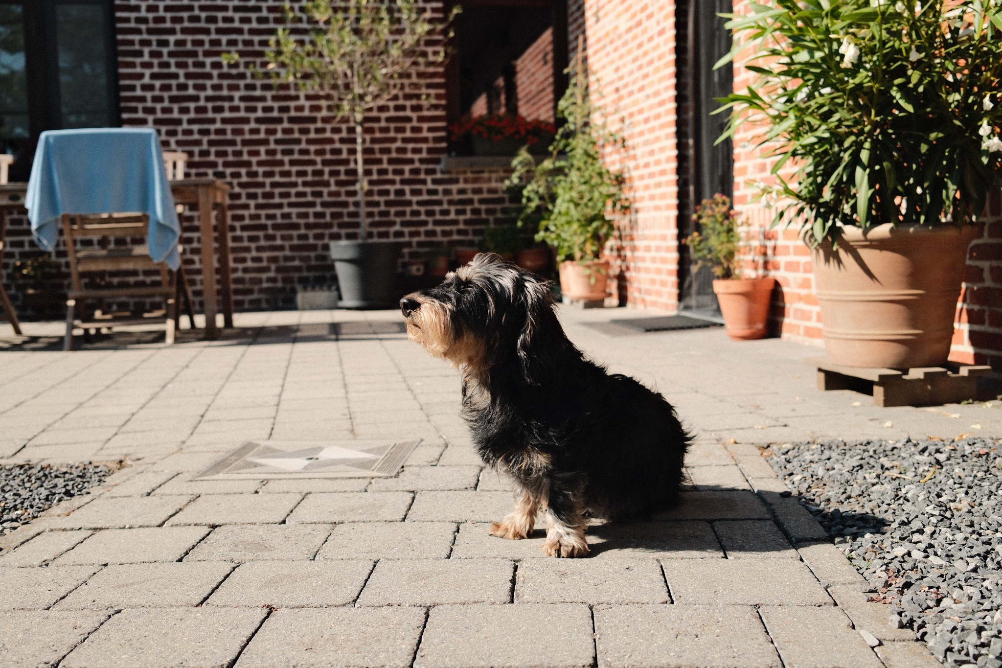
Classic Chrome
Classic Chrome · warm
WarmVibrant
1 photo · 1 save
first here: @lukewais

Classic Chrome
Classic Chrome · warm
WarmNostalgic
1 photo · 1 save
first here: @msaidalqudhri

Classic Chrome
Golden Chrome
WarmVibrant
1 photo · 1 save
first here: @snapsbyhan
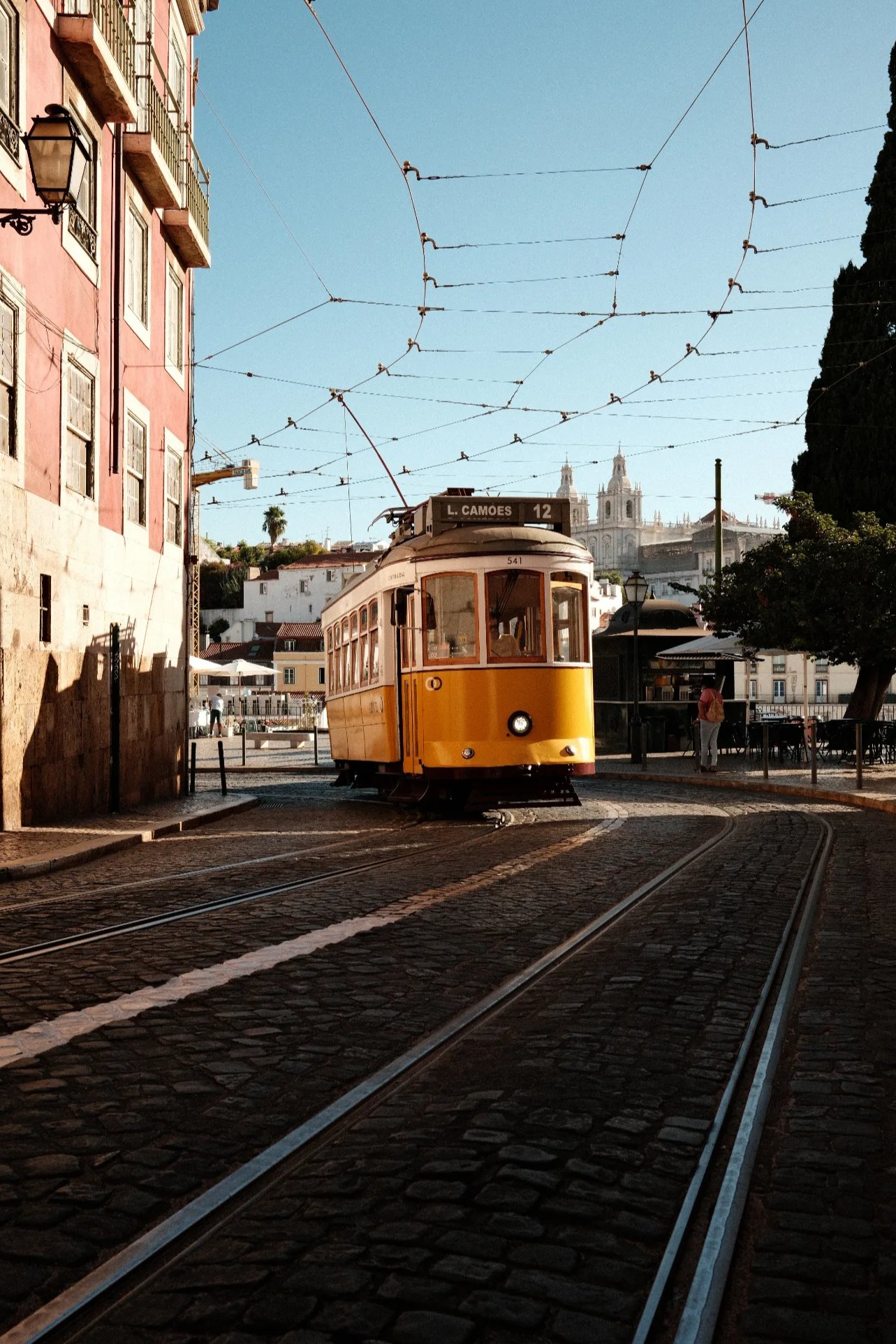
Classic Chrome
Classic Chrome
WarmVibrant
1 photo
first here: @lennisun

Classic Chrome
Classic Chrome
VibrantNostalgic
1 photo
first here: @milan

Classic Chrome
Kodak Portra 800 v3
VibrantNostalgic
1 photo
first here: @giovannid

Classic Chrome
Kodak Portra do Sol
WarmVibrant
1 photo
first here: @timurse
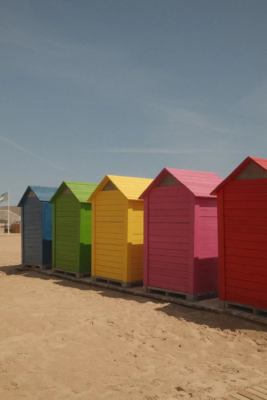
Classic Chrome
Summer Chrome
WarmVibrant
1 photo
first here: @qbraem